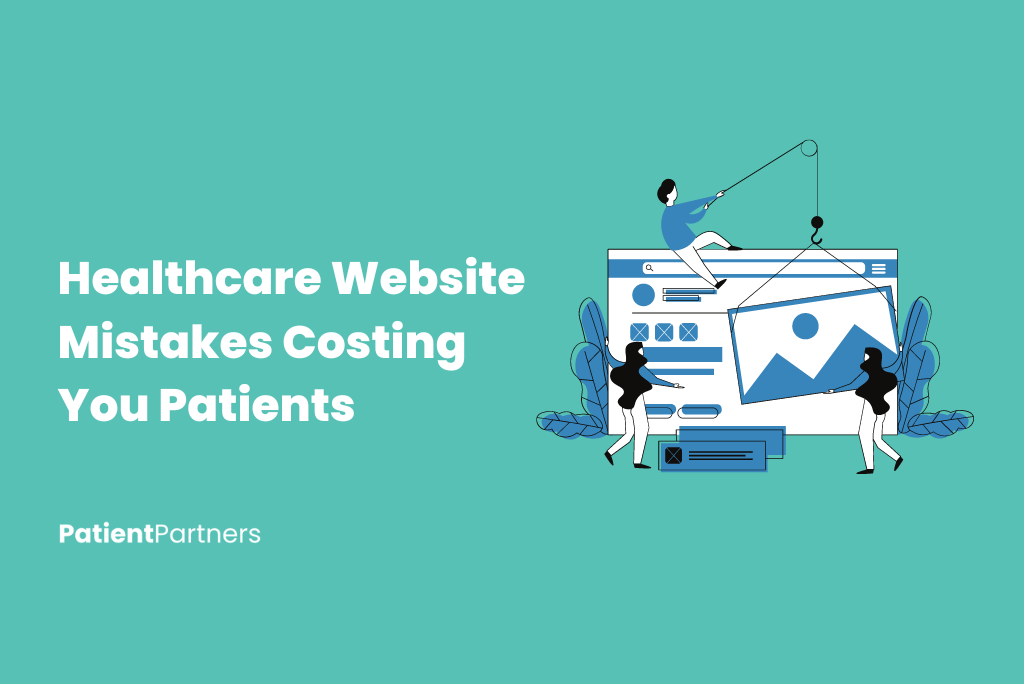
Creating a successful healthcare website is no easy task. You want visitors to find the information they need quickly without feeling frustrated. But too often, mistakes clutter the path.
Let’s cut to the chase.
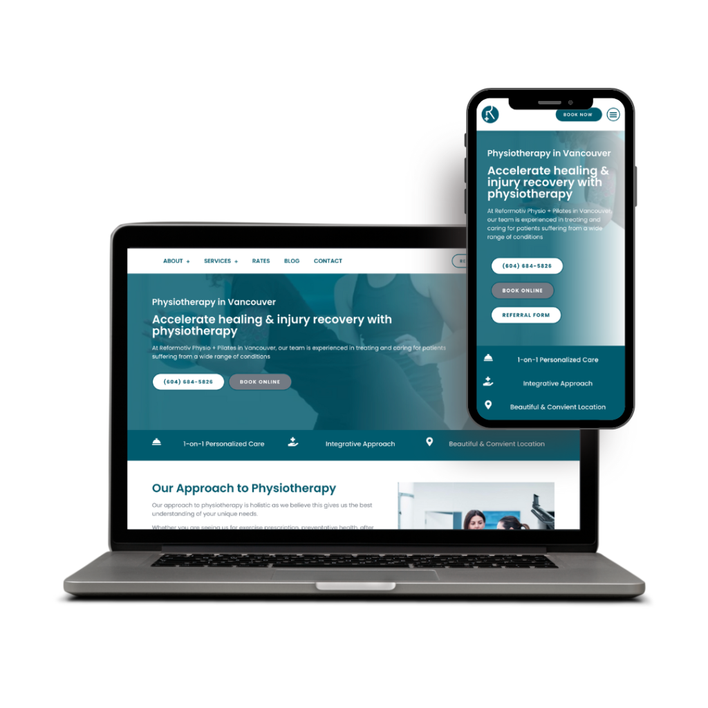
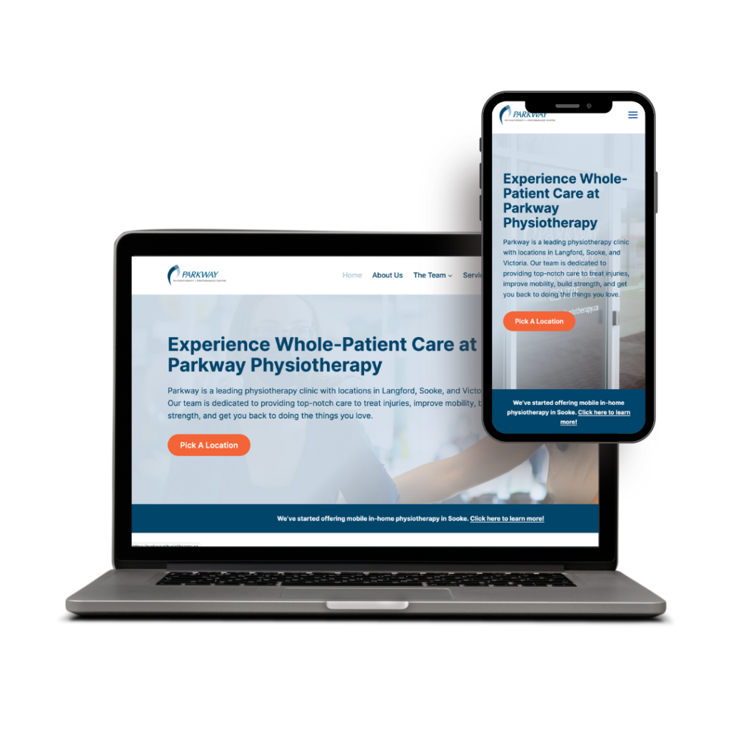
Poor navigation, outdated design, and lack of clear contact info are some of the biggest blunders you can make. They can drive potential patients away before you even have a chance to help. Make sure your site is a welcoming presence, not a confusing maze.
Picture this: a patient lands on your website. They need an appointment, fast. If they can’t find what they need in a few clicks, they’re gone. You need to know the pitfalls to avoid or you risk losing their trust.
Critical Importance of User Experience
You know that first impressions matter. A seamless user experience (UX) on your healthcare website can be the key to building trust. Frustrated users mean lost opportunities and, ultimately, a dip in credibility.
Navigation Pitfalls
Clumsy navigation can frustrate visitors quickly. Make sure menus are clear and logical. Users should easily find what they need, whether it’s booking an appointment or accessing medical records.
Consistency in design elements, like buttons and fonts, plays a huge role. Link placement is crucial—avoid burying important pages under layers of ambiguity. It’s not just about aesthetics. A good design means smooth and straightforward journeys for your patients.
Consider having a search bar that’s easy to spot. It can act as a lifeline for users who get lost. Including breadcrumbs helps, too.
Mobile Responsiveness Issues
About 54% of web traffic comes from mobile devices. If your site isn’t mobile-friendly, it’s like throwing away potential patients.
Adjust your layout and font sizes to fit smaller screens. Users should scroll less and tap more intelligently. Buttons should not be too small, or too close together. Text should be readable without zooming.
A responsive design doesn’t just stop at resizing images. Test on different devices and browsers to ensure it works everywhere. Broken elements lead to frustrated users. They might look for services elsewhere.
Slow Load Times
Patience is not infinite—especially online. A one-second delay in page load time can result in 7% fewer conversions.
Optimize images and scripts to speed things up. Strategies like using browser caching and minimizing HTTP requests make a real difference. Unnecessary plugins can drag down speeds as well, so keep those to a minimum.
Tools like Google’s PageSpeed Insights can help identify weak spots. Regular checks and updates keep your site running smoothly. Fast load times mean happier users and fewer drop-offs—plain and simple.

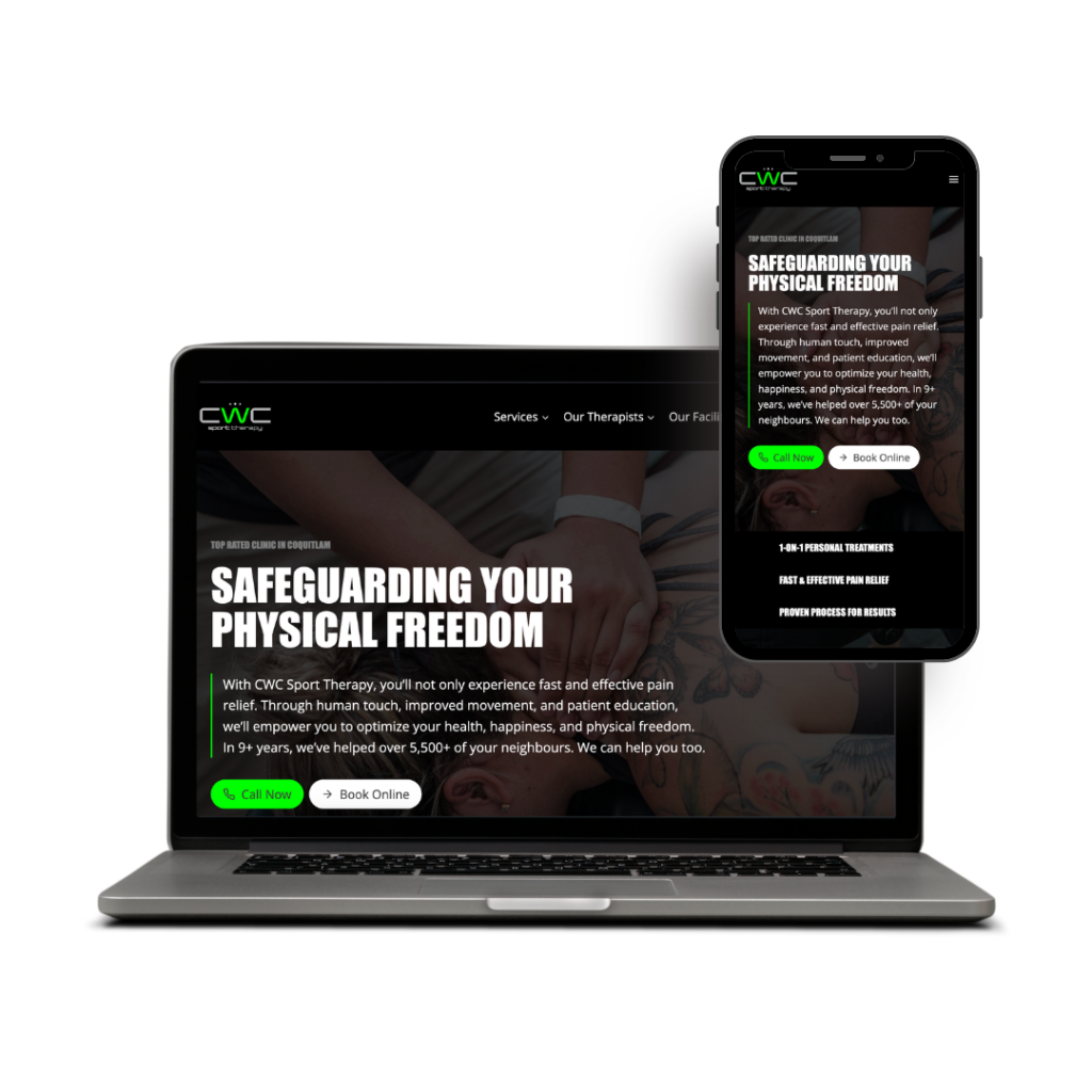
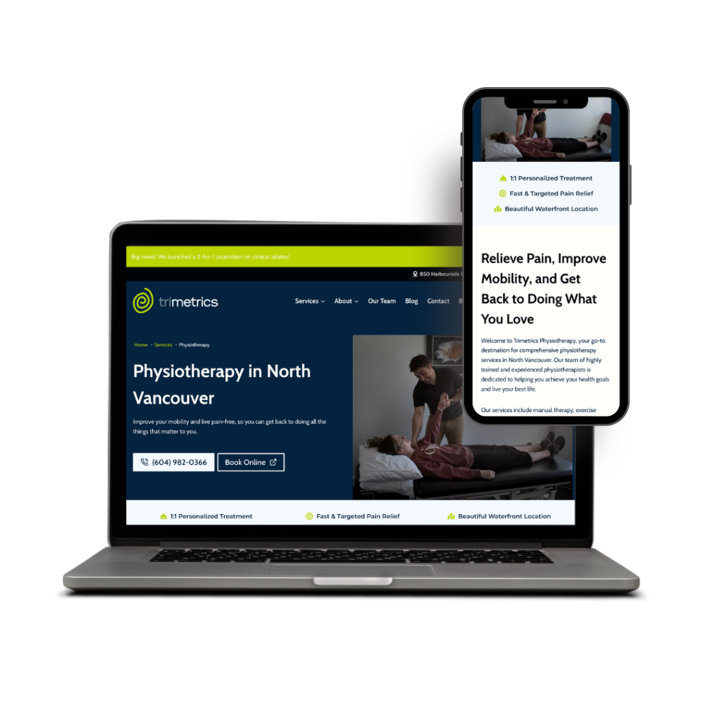
Design Flaws and Visual Elements
When users visit a healthcare website, they expect a clean, easy-to-navigate interface. Poor design can confuse visitors, making it hard for them to find what they need. Elements like complex layouts, conflicting color schemes, and poor organization can deter users right away. Addressing these issues can significantly enhance user experience.
Overwhelming Interfaces
A busy interface can overwhelm users. Too many buttons, links, or images can cause confusion. Users favor simplicity where each element serves a clear purpose. Cluttered pages can lead to frustration and high bounce rates. Reducing visual noise increases usability and helps users navigate easily.
Action Tip: Streamline content by keeping only essential items on each page. Group similar features together for clarity.
Organized interfaces can improve user interaction. Layouts should lead visitors naturally through the site, guiding them intuitively to the information they seek. Remember, less is more.
Mismatched Color Schemes and Fonts
Colors and fonts largely affect how users perceive your site. Mismatched or clashing schemes can make it hard to read and unprofessional. Consistent branding reassures users and strengthens trust.
Color Pitfalls: Avoid putting bright text on a bright background. This reduces readability. Use contrast wisely for focus.
Selecting the right fonts is crucial. Choose easy-to-read fonts and maintain consistency. Changes in font style without reason may disrupt the user’s experience.
Rich visuals attract attention, but misuse can drive visitors away. Always aim for harmony and balance in design choices to enhance credibility.
Lack of Visual Hierarchy
Visual hierarchy helps users understand what to look at first. Without it, important information might get lost. Structure is essential in guiding users through your content.
Think of Visual Priority: Use headers, bold text, and spacing effectively. Clear hierarchy means users grasp the main message right away.
Your website should communicate the right message quickly. This efficiency gives potential clients confidence in your services. Always prioritize clarity, ensuring users can find key details without hassle.
Critical content should stand out. Use size, color, and positioning to emphasize key points. Proper visual hierarchy leads to better user engagement and satisfaction.
Content Challenges
Creating strong content for your healthcare website can be tricky. Mistakes often involve poor planning or missing vital information and strategies. Let’s examine key areas you should address.
Insufficient Content Strategy
You cannot afford to wing it when it comes to content strategy. Planning is key. Without clear goals, your website risks being disorganized. Patients and caregivers need easy access to information. An effective strategy should map out content types, target audience, and publishing schedules.
Make sure to tailor your content to serve the needs of your audience. Consider FAQs, health tips, and patient stories. Use analytics to track engagement and tweak your approach when needed. Consistent updates are crucial to maintaining relevance and trust. Remember, clarity and accessibility can make or break the user experience.
Ignoring SEO Best Practices
Ever wonder why your site isn’t appearing in search results? Ignoring SEO can cost you. Search engines rely on keywords, meta tags, and quality content to rank your pages. It’s not just about cramming keywords. Quality matters. Engaging and informative content can boost your rankings and visibility.
Consider using tools to identify the best keywords for your niche. Optimize page titles, headers, and descriptions. Don’t forget mobile-friendliness, which is crucial for search rankings. Implement proper internal linking to guide visitors through your site. Keep pages fast-loading and error-free since site performance impacts SEO.
Get a free website and SEO audit
Trust and Credibility Issues
When users visit a healthcare website, trust is paramount. The website must instill confidence and assure users of its legitimacy. Without trust, users will quickly leave and not return. This section highlights three key areas: missing contact information, lack of social proof, and inadequate security measures.
Missing Contact Information
Imagine visiting a healthcare site but finding no contact details. It instantly raises red flags. People want to know who they’re dealing with, especially regarding health matters. Contact details such as a phone number, email, and physical address boost credibility significantly. Ensuring this information is easy to find helps build trust.
A well-designed “Contact Us” page can make a significant difference. Users feel more comfortable knowing they can easily reach out if needed. Make the information current and reliable. Being accessible builds trust and shows users your services are dependable.
Lack of Social Proof
Social proof plays a huge role in establishing credibility. It reassures users that they’re making the right choice. Featuring testimonials from satisfied clients or patients can strengthen trust. Share real stories.
Online reviews and ratings are another form of social proof. Encourage reviews on trusted platforms. Visibility in reviews can sway opinions. Showcasing affiliations or certifications can also help. Users want assurance that others have had positive experiences. It isn’t just about boasting; it’s about showing your value and reliability.

Inadequate Security Measures
Security is not just an added feature; it is essential. Patients need to know their medical records and personal information are safe. Without strong encryption or clear privacy policies, trust diminishes. Highlight your website’s security protocols.
Features like SSL certificates and two-factor authentication offer peace of mind. Stressing your commitment to privacy will earn users’ confidence. Display badges or seals from security authorities. When users feel secure, they are more likely to engage. Protecting data shows respect and care, and it strengthens your reputation immensely.
Conversion Optimization Mistakes
Many healthcare websites lose potential clients due to avoidable mistakes. Pay attention to call-to-action buttons, clear and engaging forms, and the power of A/B testing. Each of these elements can significantly impact your conversion rates. Let’s dive into the crucial points.
Confusing Call-to-Action Buttons
Call-to-action (CTA) buttons should be easy to find and understand. If they’re not, users might leave without taking the next step. Ensure that your CTAs are clear and direct.
Example: If you want visitors to book an appointment, use phrases like “Book Now” instead of “Submit.” The language needs to guide users toward the intended action without causing confusion. Color plays a role too. Highlight CTAs with colors that stand out from the rest of the page.
Placement is key. Position your CTAs where users can easily spot them, such as at the end of a page or prominently in the header.
Forms That Drive Users Away
Long and confusing forms on your website can result in users abandoning them altogether. People value their time and want a quick process. Be concise with questions, asking only for essential information.
Tip: Utilize drop-down menus and checkboxes to make it simpler. Clearly labeled fields also help. Break down lengthy forms into multi-step processes if necessary.
A good form is both user-friendly and mobile-optimized. With more people using smartphones, ensure the forms adjust smoothly to smaller screens. Test how your forms look and function on mobile devices to avoid frustrating users.
Neglecting A/B Testing
Achieving higher conversion rates often requires you to experiment. Without A/B testing, you might miss out on understanding what truly resonates with users. This process involves testing different versions of a webpage to see which performs better.
For instance, try out different CTAs or form lengths to determine what leads to more conversions. You can run tests on headlines, images, or even color schemes.
Make sure you analyze the results of each test. The data will help you make informed decisions about what changes need to stick and which should be scrapped. It’s a practice that can set your site apart in the healthcare industry.
Technical and Backend Shortcomings
Every healthcare website needs a solid foundation. Without it, your site can crash at the worst times, rely on outdated systems, and even risk patient data. Watch out for these key technical pitfalls and ensure your website runs smoothly and securely.
Poor Hosting Choices
Choosing the right hosting service is crucial. Slow load times can frustrate users, and downtimes can cost you clients. Stick to hosting providers known for reliability and speed.
Look for those offering 99.9% uptime guarantees. Check user reviews and performance stats before signing up. Also, consider scalability options. As your site grows, so should your hosting plan.
A flexible hosting provider can adapt to increasing traffic without crashing. Prioritize security features like SSL certificates and backups. These can prevent data loss in case of cyberattacks or server failures.
Outdated Technology Stack
Using old technology may save costs initially, but it can cost more in maintenance and upgrades. An outdated tech stack can slow down your website and make it incompatible with new applications.
Stay updated with the latest technology that supports modern features and security standards. A well-maintained technology stack promotes better user experiences and site efficiency.
Don’t forget the backend! Employ current programming languages, frameworks, and tools. Regularly updating your system minimizes vulnerabilities from cyber threats. Evaluate your stack periodically and upgrade components as needed.
Lax Security Protocols
Security should be a top priority for any healthcare website. Handling sensitive information demands robust protection. Weak security protocols can lead to data breaches and loss of trust.
To boost security, implement strong encryption methods and conduct regular security audits. Consider a virtual private network (VPN) for added security when accessing sensitive data remotely.
Use multi-factor authentication (MFA) to secure access points. Train staff on cybersecurity best practices to prevent human error. Monitor activities to catch unauthorized access quickly. Investing in advanced security measures protects patient data and preserves your reputation.
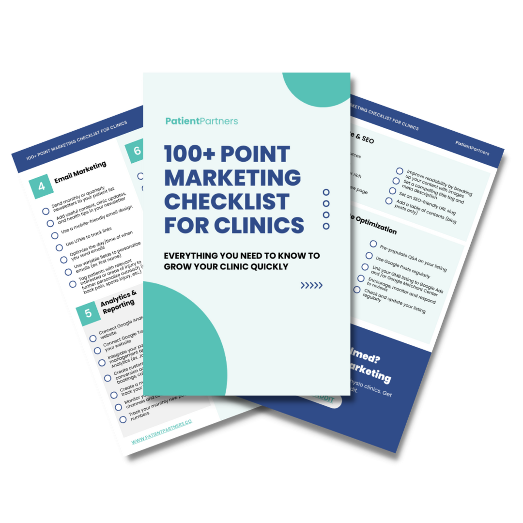
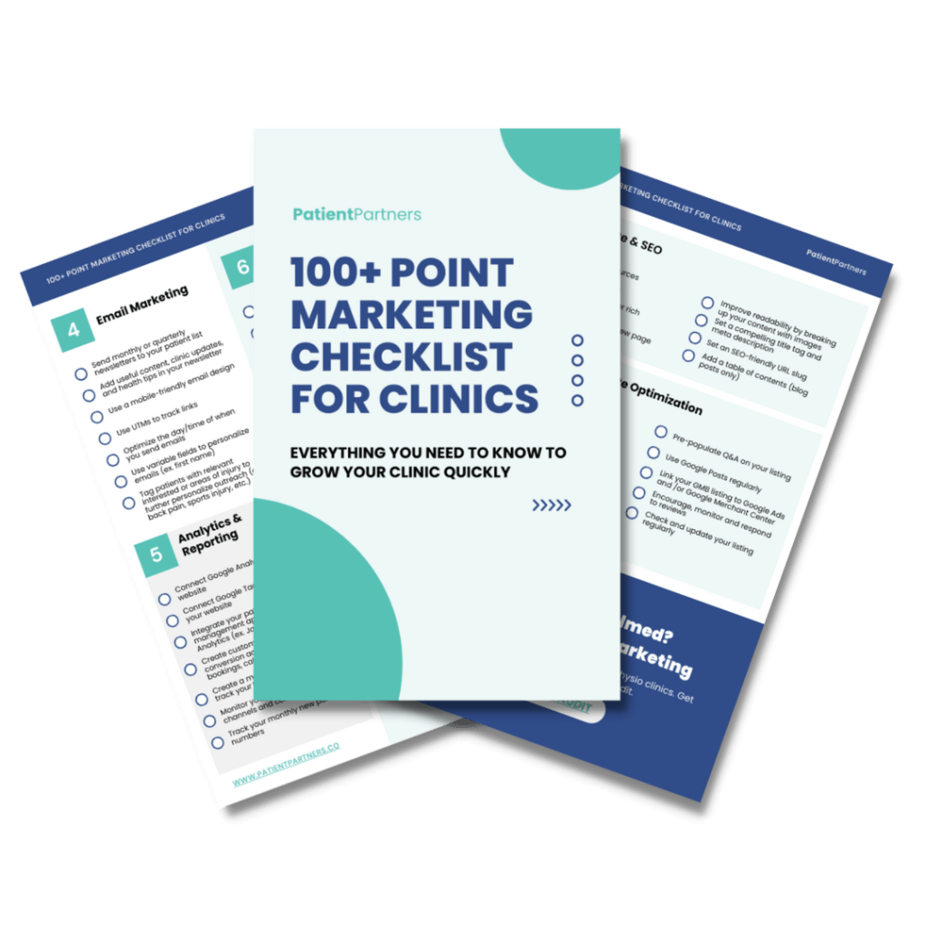
Don’t leave empty handed
Get the 100+ Point Marketing Checklist for Clinics
It’s packed with tips and strategies you can use to grow your clinic today.
Analytics and Feedback Loopholes
Unlock the power of data on your healthcare website! Ignoring these tools could hamper progress and growth. Stay ahead by diving into user stats and creating a plan for ongoing updates.
Disregarding User Analytics
Skipping user analytics is like trying to drive blindfolded. You can’t improve if you don’t know what’s happening. User analytics can reveal who is visiting your site, how they’re interacting, and what content draws the most attention.
To fix this, start by setting up a good analytics tool, like Google Analytics. Track key metrics such as website traffic, bounce rates, and time spent on pages. Paying attention here can show which pages need a boost or redesign. Use these insights to tailor your website content to meet user needs.
Missing analytics might mean missing out on targeted marketing opportunities. For example, high bounce rates could indicate users are not finding what they need. Find these pain points and address them right away.
Lack of Continuous Improvement Plan
Without a plan for ongoing improvements, a website might stagnate. This leads to outdated info and poor user experience. You need a roadmap for regular check-ups and tweaks to keep everything fresh and useful.
Create a schedule for regular updates. Monthly reviews can help catch small issues before they become big problems. Use feedback tools like surveys and comments to get firsthand information from users.
Make changes based on what users actually want. This shows that you value their input and are committed to the best experience possible. Keep refining and adjusting your site to keep visitors engaged and satisfied.