Your website is often the first place potential patients meet your practice.
A well-designed chiropractor website needs to balance professional credibility with user-friendly features that help patients quickly find information and book appointments. Your site isn’t just a digital business card anymore—it’s the front door to your practice, like it or not.
Many chiropractors struggle with websites that don’t reflect the quality of care they provide. You might have a spotless office and fantastic patient outcomes, but if your website looks outdated or confusing, people will just click away to someone else.
Core Elements of Chiropractor Website Design
A chiropractor website needs clear branding, smooth navigation, and content that helps potential patients understand your services. These pieces work together to build trust and turn visitors into appointments.
Professional Visuals and Branding
Your website design should instantly communicate who you are and what you offer. Start with a clean logo that actually matches your practice’s personality.
Use real photos of your clinic and staff—ditch the stock images if you can. People want to see the actual environment where they’ll get care, not some generic handshake.
Color choices matter more than you might think! Stick with two or three main colors, and use them consistently. Blues and greens usually feel calming and trustworthy for healthcare, but hey, if your vibe is different, go with what feels right.
Your homepage hero image needs to grab attention quickly. Show a welcoming treatment room or a smiling patient. Toss in your practice name and a short tagline that hints at what makes you different from the chiropractor down the street.
Typography should be simple and readable. Skip the fancy fonts that make people squint. Body text should be at least 16 pixels on desktop, maybe a little bigger on mobile.
User Experience and Easy Navigation
Navigation can make or break your chiropractic website. People should find what they need in three clicks or less—nobody has patience for a scavenger hunt.
Your main menu should cover the essentials: Services, About, Contact, and New Patients. No need to get too clever with labels here.
A sticky header keeps your navigation visible as visitors scroll. It’s a small tweak, but it saves people from scrolling all the way up just to jump to a different page.
Mobile responsiveness isn’t optional at this point. Over half of web traffic comes from phones and tablets. Test your site on different devices—make sure buttons are easy to tap and text stays readable without zooming in.
Page speed really matters. Compress your images and cut out unnecessary code. Try to keep load times under three seconds, or people will bail.
Include a bold “Book Appointment” button that stands out. Put it in your sticky header and at the end of key pages. On mobile, make your phone number clickable so visitors can call you with one tap.
Promoting Chiropractic Services
Your services page should do more than just list treatments. Explain each one in plain language—skip the jargon—so patients actually understand what you do.
Create separate pages for conditions you treat most often. For example, a page about low back pain should explain causes, how you diagnose it, and what treatments you offer.
Before and after stories from real patients add major credibility. Share their challenges, your treatment plan, and the results they saw. Always get written permission before posting patient info, of course.
Educational content helps position you as an expert. Write blog posts answering questions like “When should I see a chiropractor?” or “What happens during my first visit?” This kind of content helps people find you online and builds trust in your expertise.
Examples of Chiropractic Websites
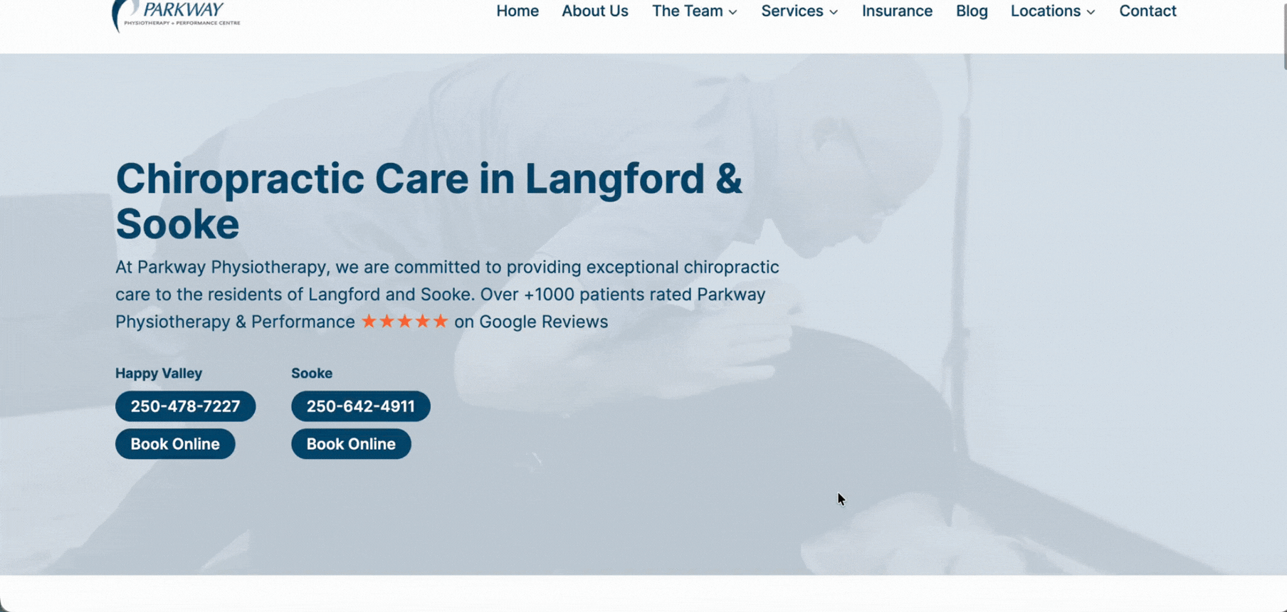
Parkway
Parkway is a 4-location clinic offering chiropractic care. Their website is clean, clear, and easy to navigate. Their website combines warm visuals with clear messaging to create a strong sense of trust and professionalism. Their use of photography feels authentic—not stocky—which helps humanize the brand.
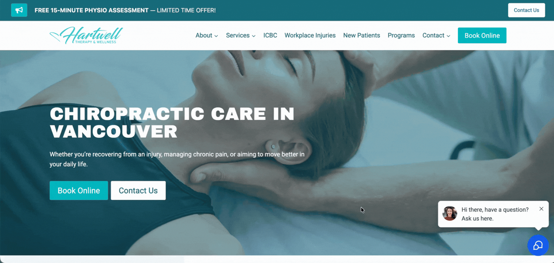
Hartwell Therapy
Hartwell’s website is clean, modern, and highly conversion-focused. Their homepage immediately communicates who they help and how—with strong calls-to-action like “Book Online” above the fold.
Features That Build Trust and Engagement
Trust doesn’t just happen on chiropractic websites. You need features that actually show your competence, honesty, and care for patients.
Showcasing Patient Testimonials
Real patient stories make your practice feel human. When visitors see testimonials from people who faced similar problems, they start to believe you can help them too.
Put testimonials front and center on your homepage and service pages. Include the patient’s full name and photo if you can—generic reviews with just initials look fake. Video testimonials are even better because people can see and hear genuine emotions.
If someone shares how your treatment helped their sports injuries or chronic back pain, those details matter much more than vague praise. Group testimonials by condition or service type so visitors can find stories that match their own situation.
Integration of Video and Multimedia
Videos change how potential patients see your practice. A quick tour of your clinic helps nervous first-timers know what to expect. Film short explanations of treatments, maybe show how adjustments work or what acupuncture looks like.
Educational videos help you come across as an expert in alternative medicine. Explain common conditions or demonstrate simple stretches patients can try at home. Keep videos under two minutes—people’s attention spans are short online.
Live chat features let visitors ask questions immediately. Some people just want to know if you accept their insurance or treat a specific issue. Adding this interactive option shows you’re accessible and willing to help.
Highlighting Wellness, Treatments, and Specialties
Be crystal clear about what you actually do. List every service your chiropractic wellness center offers, from standard adjustments to specialized treatments.
Don’t assume people know what chiropractors can help with! Sometimes, folks have no clue just how broad your skill set really is.
Create dedicated pages for each major service. Your laser therapy page should explain what conditions it treats and how many sessions patients typically need.
Let people know what results they can expect. If you offer family chiropractic care, describe how you work with kids differently than adults.
Use simple language to explain chiropractic services. Skip the technical jargon that confuses people—nobody wants to feel lost when they’re already in pain.
When you mention a treatment approach, tell visitors why it matters to them and their pain relief. Your specialties set you apart from other practices, so make them obvious.